Application layout & UI elements
After logging into Service Hub the main application layout will be displayed. In this section we will provide you with an overview of the UI elements that make up the application and how they are arranged in the layout.
We will start with the 'big' building blocks and get into the more detailed elements of Service Hub, that make up the individual pages, at a later stage.
General application layout
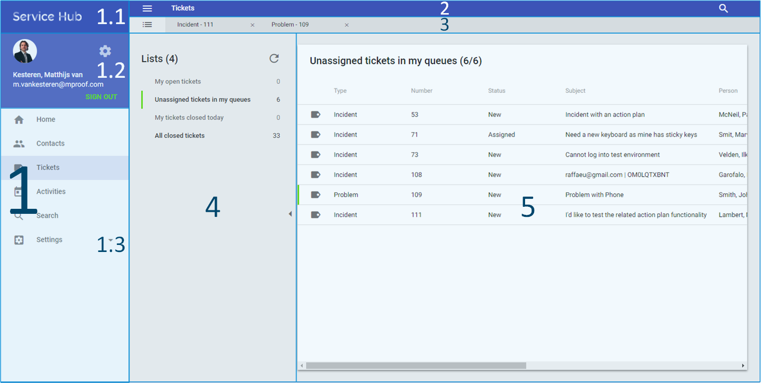
The image below shows the general application layout of Service Hub. In here you will notice different elements where you can navigate to.
 The elements shown are:
- Navigation drawer
1.1. Logo
1.2. User profile
1.3. Topics menu - Search bar / Top bar
- Tab bar
- List selector
- Lists
1. Navigation drawer
The navigation drawer slides in from the left and spans the full height of the screen. The behavior of the navigation drawer is slightly different between desktop and mobile & tablet.
In desktop UI, the navigation drawer is persistent and open by default and closes by selecting the menu icon, and stays closed until opened by the user.
In tablet & mobile UI, the navigation drawer is temporary. Temporary navigation drawers can toggle open or closed. Closed by default, the drawer opens temporarily above all other content until a section is selected.
The navigation drawer contains three parts with information:
1.1 Logo
The application logo. There is no user functionality attached at the moment. Its function is primarily a placeholder for future branding options.
1.2 User profile
The user profile shows who is currently logged in. Service Hub uses the online service of Gravatar to retrieve your avatar image based on your email address. Pressing the avatar image (or icon if no image can be found) or the sprocket-icon will bring you to the user profile detail page where you can manage your user preferences.
1.3 Topics menu
Below the user profile the topics menu is displayed. The topics menu contains the main topics (and thus navigation destinations) for Service Hub. Via the topics menu you can quickly switch between topics. Clicking an item in the topics menu will bring you to the topic page, the 'home'-page of the selected topic.
The following menu items are available:
- Home: the home page which contains the Service Hub news feed regarding product updates.
- Contacts: the main entry point for contacts. Here you will be brought to your default and custom lists related to contacts.
- Tickets: the main entry point to start working with tickets.
- Activities: ditto, just for activities.
- Search: the search menu item allows you to navigate to the search results found by using the search bar.
- Settings: the settings menu is where you can find, edit, delete and of course create your custom lists.
Availability of the settings menu item
The settings menu will be limited for use on desktops only. This is done as configuring and adding new custom lists is a lot quicker on a desktop using a normal keyboard and large screen.
2. Top bar / search bar
The top bar displays the menu-icon, the current open topic and the search icon. Once you press the search-icon in the top right, the search bar opens on top of the top bar.
3. Tab bar
Here the open tabs are displayed in order of opening. The first tab is permanently visible and cannot be closed as it contains the topic page with the list selector of the current topic.
4. List selector
The list selector is the section where your default and custom lists are shown. From here you can open a specific list and load its contents in the list on the right-hand-side.
5. Lists
Displays the contents of the selected list in the list selector. Double-clicking an item in the list (single-tap on tablet & mobile), opens the detail page in a new tab.
Detail page layout
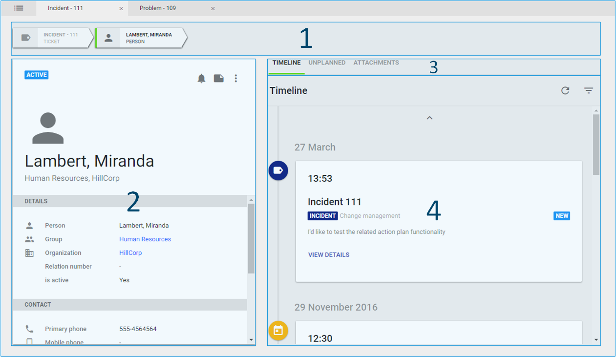
When opening a specific item (e.g. a ticket or a person) the following layout will be displayed.

The elements shown are:
1. Breadcrumbs
Using the breadcrumb you have a clear visual indication on what path you took to get to the last detail page.
2. Property card
This card displays additional information depending on the item you selected, in the example above it is displaying additional person information.
3. Secondary tabs
The secondary tabs contain:
- Time line available for contacts and tickets,
- Unplanned (activities) available for contacts and tickets,
- Material available for activities only,
- Attachments.
4. Tab content
Depending on the tab selected (see secondary tabs) it will display additional information.
Can't find what you're looking for, or was the documentation unclear? Please send us a message and help us improve our documentation.